 FA+
FA+
20129
Views
Views
1690
Favorites
Favorites
Category
Artwork (Digital) / All
Species Unspecified / Any
Gender Any
Size 1238 x 835
File Size 458.1 kB
More from kamui


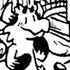
So here it is!
When the good folks at Sofawolf Press asked if I'd be interested in providing the cover for Heat 8, I jumped at the opportunity.
One of the writers featured inside (Whyte Yoté) furnished a pair of humorous haikus, which became the thematic foundation for the cover. All that was left at that point was...like two months' rendering work 9_9 Haha, this is definitely the most complex piece I've attempted to date, and there's a lot I would do differently next time around, but I'm pleased with how parts of it turned out, and I learned a ton in the process, so I'm calling it a win <3
You can see a version of the cover with the haikus in place on the Sofawolf product page (here's that link again), but being that they aren't mine, I figured I'd post a textless version here.
Modeling shout-outs to all the good folks who posed! You guys rock <3
I've moved the teaser pics to scraps -- I'll probably upload teasers for the remaining figures as well (also to scraps), just so you can see them a bit more close up.
So yeah, folks, Heat 8! Look for it this summer! Woo!
Category Artwork (Digital) / All
Species Unspecified / Any
Gender Any
Size 1238 x 835px
File Size 458.1 kB


Thanks, dude ^_^
The fisheye distortion is mostly right at the center (which will be the book's spine, obviously), so it'll be less distorted on either cover, but still generally fit together as a single connected scene. Or so the theory goes, anyway <3 There's a fair bit of perspective mangling here any way you skin it, but so it goes.
And yeah, one of my roommates who is also super adorable modeled for the lion <3


Wow, those teasers weren't NOTHIN! My favorite part is the lower left where the table is almost round as it's so close to our view. I've been reading a book on Caillebotte's work and this kind of perspective play was the center of his early work. the badger is my favorite. He has a truly 'real' feel as he's not so idealized as is most furry work (mine included). Lots of nice detail. I can totally see why this took months to complete. Yay you!


Good lord.
A stupidly high resolution version is sorely needed, FA's size limits don't do this justice ;3;
Make it happen, and I will cover you in riches that only exist in my imagination.
And I have to say, I like it even more folded in two, as front and back covers. It's amazing.
All those characters are pretty cool, too. That lion is so cute
I definitely designed it to work as two separate pieces more than as one panorama -- I think the action reads a lot more clearly when the two halves are viewed separately.
And yeah, I was glad to post some close-ups with those teaser pics because I knew the folks in the background of the full piece were going to be tiiiny <3 It does kind of hurt to paint a scene at like... five times this size, then have to shrink it way down for the web, but it should look really sharp in print, anyway.
I like the lion, too! I think he's my favorite.

I have never made this face so dramatically in response to a painting before. Except maybe this one time in a museum in front massive Bierstadt landscape.
I really have to wonder what's going on though, seems like everyone's reacting to something way off frame. It must be REALLY good coffee.
The best in the city!
But yeah, I think the action reads a lot more clearly when A) the front and back covers are viewed separately, and B) they're viewed in conjunction with the haikus. Trying to get all the lines of sight right was a challenge that I'm not sure I was really up to, but I'm telling myself that even if nobody parses the scene the way that I intended it, I'll be happy as long as they find it interesting <3
But yeah, I think the action reads a lot more clearly when A) the front and back covers are viewed separately, and B) they're viewed in conjunction with the haikus. Trying to get all the lines of sight right was a challenge that I'm not sure I was really up to, but I'm telling myself that even if nobody parses the scene the way that I intended it, I'll be happy as long as they find it interesting <3


They're anthologies of short stories, art, comics, and various other goodies. The content is adult, but not gender-/sexuality-specific, so there's something in it for everybody. There's a link to the product page in the submission info -- take a look if you're curious! You might also check out the previous issues as well.


Well I'm definitely going to get this issue not just for the stuff in side ;3 but for the cover art
( Going to get this to display the book http://www.suck.uk.com/product.php?.....arch_text=book )
( Going to get this to display the book http://www.suck.uk.com/product.php?.....arch_text=book )
Cheers, dude!
And that book frame is rad, although I would bet dollars to donuts it was designed with those Penguin classics specifically in mind <3 I'm not sure how well a letter-sized magazine line Heat would fit in the little paperback-format frame, but I appreciate the sentiment, anyway!
And that book frame is rad, although I would bet dollars to donuts it was designed with those Penguin classics specifically in mind <3 I'm not sure how well a letter-sized magazine line Heat would fit in the little paperback-format frame, but I appreciate the sentiment, anyway!

Dude, I think no amount of text can go into enough detail of how awesome this is. The characters all fall into their own stories, all share appeal and character, the setting is gorgeously designed, the lighting is insane (thank God you did it in black and white for checking values), the rendering is out of this world.
Just, I've never seen such a varied cast of characters fall into the place of a setting so believably. Everything was designed. You are a master of your work. This clearly illustrates that, and I will go even as far as to say you created the BEST piece I've ever seen on F.A. By miles. I hate saying that so objectively and blunt to shy away other artist's merits, but God dammit dude, you're just that friggin' good!
Just, I've never seen such a varied cast of characters fall into the place of a setting so believably. Everything was designed. You are a master of your work. This clearly illustrates that, and I will go even as far as to say you created the BEST piece I've ever seen on F.A. By miles. I hate saying that so objectively and blunt to shy away other artist's merits, but God dammit dude, you're just that friggin' good!
Alright, so let me get this straight:
Jesús is observing the Lady.
The Leopard is photographing the Lady, particularly up her smoking tush.
The Lady is reaching for some damn coffee.
Earnest is glaring at the Raccoon, gesturing an order.
The Raccoon is hungrily watching Thomas.
Thomas is astounded at the Lion.
The Lion is just bashfully shocked, looking off camera at a distance.
Haywood is eying, tugging his Lion.
Archie is romanticizing about Haywood.
And the Unicorn is looking away and down, towards the fourth wall, but not quite at us all that much.
And I'm just witnessing this snapshot of Heat. Correct me if I'm wrong. But-
Damn yo, that's HOT.
In theory, the front and back covers should stand on their own, so all the action on either half of the piece should be contained to that side in general.
It's totally open to interpretation, but the way I saw it going down was:
Jesús the coati, Thomas the bear, Archie the rat, and Hunter the ocelot are all flipping out over Desirée the ringtail (and her ass).
Meanwhile, Alesso the unicorn could not care less because he is queer as a three dollar bill.
Haywood the fox is dragging Mark the lion off to the restroom for some shenanigans.
Smitty the badger gets dressed after being Haywood's last ride, and Earnest the stag informs you that the lion is actually the fox's third for today.

Aw man, that's so much more awesome! I love this backstory haha, I finally see a clearer picture of what's going on!
Oh okay, so this composition is split in half in such a way that two different scenes are going on in the same picture! That's so insane cool! Genius even.
Oh okay, so this composition is split in half in such a way that two different scenes are going on in the same picture! That's so insane cool! Genius even.
It's kind of a necessity of the wraparound cover format <3
In theory, it should all connect together as a full image to some extent, but 99% of the time, people are either going to be looking at the front cover (right half) or the back cover (left half), so it's more important that they hold up on their own.
In theory, it should all connect together as a full image to some extent, but 99% of the time, people are either going to be looking at the front cover (right half) or the back cover (left half), so it's more important that they hold up on their own.
They totally do! What's even more incredible is how they hold together on their own. Even the characters themselves you've been posting in your scraps hold their own. It's like everything supports the other while sustaining itself masterfully.
I swear I'm going to train myself to become your level of expertise. You are one of my biggest inspirations! I've been looking at your entire gallery and reading your knowledge filled comments and observations. I love it, every second you put into your craft!
I swear I'm going to train myself to become your level of expertise. You are one of my biggest inspirations! I've been looking at your entire gallery and reading your knowledge filled comments and observations. I love it, every second you put into your craft!
That's very kind of you to say, and hearing that I make you want to make art is about the best compliment I could hope for!
All of the stuff I've picked up has been from looking at and reading the words of the illustrators I love, so I'm super happy to pass some of that along! I think the single biggest thing for me has just been trying to really think about what each color or pose or prop or detail adds to a piece, and to try to make sure that they all contribute to telling the story. Even without any technical skills or fancy tricks, just really thinking about the image while you're making it is a huge help, I think <3
All of the stuff I've picked up has been from looking at and reading the words of the illustrators I love, so I'm super happy to pass some of that along! I think the single biggest thing for me has just been trying to really think about what each color or pose or prop or detail adds to a piece, and to try to make sure that they all contribute to telling the story. Even without any technical skills or fancy tricks, just really thinking about the image while you're making it is a huge help, I think <3
Very kind of you to say! It was definitely chaos before I went in and painted all the values out in monochrome. It meant a fair bit more work, but I figured at the point that I was going to do a scene this big and complex (and with ten figures 9_9), it made sense to spend the extra time to do it right <3


This is an astounding amount of work :O Such beautiful color tones and spot on character isolation. Everyone's so different, and unique, and appealing. This is going to skyrocket the amount of requests you get for con books and stuff, lol. Congrats on finally being done! I sure hope you celebrated!

DUDE DUDE is this based on that coffee hollow shop you took us to??? omg
this is spectacular in color!! I think that deer is going to completely wreck those paper star lanterns if he works there long enough... I love the way you worked the text into the wall... AWESOME.
this is spectacular in color!! I think that deer is going to completely wreck those paper star lanterns if he works there long enough... I love the way you worked the text into the wall... AWESOME.
Mmmmmmmaybe <3 The Sofawolf guys asked for a cafe scene, and it was too cute a spot to pass up.
YES, he will totally shred them. That's why he's so emo. He knows the hardships of being freakishly tall.
(I seriously bonk my head on light fixtures all the damn time. Stag-man's gonna destroy a couple for me as payback <3)
YES, he will totally shred them. That's why he's so emo. He knows the hardships of being freakishly tall.
(I seriously bonk my head on light fixtures all the damn time. Stag-man's gonna destroy a couple for me as payback <3)


Well, that's what I love so much about this. x3 The details are exquisite, and the goofiness just gives character to each of the dudes in the pic (is the person in the dress a guy? Sure looks like a lady...) There's a bunch of different stories going on, and it's like an entire into animation in one gorgeous image.


I should have known! Though I'm glad I didn't - it would have spoiled a very lovely surprise <3 I'm happy to see another Heat surfacing! =
I was right about one thing, though - I am absolutely pleased to see the what's got everyone's attention... I enjoy sexuality not just in act, but also in context. - and there's certainly plenty of context there to appreciate!
I was right about one thing, though - I am absolutely pleased to see the what's got everyone's attention... I enjoy sexuality not just in act, but also in context. - and there's certainly plenty of context there to appreciate!


うわー、motoさん優しすぎる!
描いてたときはあっちこっちmotoさんの絵を参考にしてましたから、真似できないのはこっちの台詞ですよ!
終わってみれば、一貫したパレートを使うより、motoさんがよく使う、キャラクターごとに色を変えた非写実的な、もっとスタイルを利かせた配色にしたら見栄えよかったんだろうなって後悔したり…
でもそんな大胆な色使いが上手くできる自信がとてもないんで、まあ、無難にリアルっぽくしてよかったかな?
あと、ギャラリーを振り返ってみれば、俺ってネクタイフェチ?…だよね、こりゃ。
カッコいいし、色々便利(?)だし、まあいっか <3
こっちこそmotoさんの絵をいつだって楽しみに待ってます!
描いてたときはあっちこっちmotoさんの絵を参考にしてましたから、真似できないのはこっちの台詞ですよ!
終わってみれば、一貫したパレートを使うより、motoさんがよく使う、キャラクターごとに色を変えた非写実的な、もっとスタイルを利かせた配色にしたら見栄えよかったんだろうなって後悔したり…
でもそんな大胆な色使いが上手くできる自信がとてもないんで、まあ、無難にリアルっぽくしてよかったかな?
あと、ギャラリーを振り返ってみれば、俺ってネクタイフェチ?…だよね、こりゃ。
カッコいいし、色々便利(?)だし、まあいっか <3
こっちこそmotoさんの絵をいつだって楽しみに待ってます!


I really need to ask what type of room or store you aim for in this pic? I can't decide it is a cafe, bar or a hot shower station.
Since if it was a cafe then why the badger are half naked?
And another question please. Why the lion wearing a tie but wore a short pants? Or where would his another pants go?
Anyway, a big applause to you sir. This is as best as clean art can be and I definitely buying this book if I find the book that has the cover like this one.
Remarkably done!
It's based on a cafe here in my city <3 The badger is half-naked because the fox just got through working him over in the bathroom.
And I'm a firm believer that you can wear a tie with any pants. Or with no pants.
And you'll be able to order the book directly from Sofawolf once it comes out -- here's the link!
And I'm a firm believer that you can wear a tie with any pants. Or with no pants.
And you'll be able to order the book directly from Sofawolf once it comes out -- here's the link!


I've been blown away by this illustration since the first sketches you sent!
But even more amusing -- we've got The Lion, The Witch and The Wardrobe playing in the background tonight, and at the point where the fox is describing Aslan to the Beavers as, "Like nothing you've ever seen" (or something like that), the fox has this desire in his voice like he's totally got a hard-on for the god-lion, and I couldn't help but picture your fox-lion couple here. :D
But even more amusing -- we've got The Lion, The Witch and The Wardrobe playing in the background tonight, and at the point where the fox is describing Aslan to the Beavers as, "Like nothing you've ever seen" (or something like that), the fox has this desire in his voice like he's totally got a hard-on for the god-lion, and I couldn't help but picture your fox-lion couple here. :D
Hah! That's awesome <3
I'd been reading Samuel Pepys's diary, and he's got a line in his Dec. 26, 1662 entry about how he will "endeavour to joyne the lion’s skin to the fox’s tail." It's a version of an adage that seems to go back to Plutarch, but it totally made me snerk when I read it, and it was the direct motivation for the characters in the cover <3
And I'm really glad you like it! That's goal number one, so it's good to hear ^_^
Now that's an unexpected explanation for your inspiration for the image! I am greatly amused, and I will have to learn more about the meaning and use of this adage.
I am rather curious what had you reading the diary of a 17th century Londonite (Londoner? Londweller?) Was it personal interest in history? Research for another project?
I am rather curious what had you reading the diary of a 17th century Londonite (Londoner? Londweller?) Was it personal interest in history? Research for another project?
There are a number of variations, but the closest to a definitive version I've heard is "where the lion's skin will not reach, piece it to the fox's." The lion's skin is a metaphor for overt force, military might, etc., where the fox is diplomacy, clever trickery, etc. So basically, pick your battles well, and if you can't beat 'em, join 'em!
I forget how I first stumbled on Pepys's diary, but I think it's a pretty well-known document. How ever I first got there, the diary itself kept me reading. It's a pretty fascinating window into the period and the culture, but more than that, it's awesome to get such an honest, personal record, and to see just how little has really changed. He complains about the same stuff we do, laughs at the same stuff we would, talks about embarrassing social situations we can all relate to, etc. It's just fun to read <3
I forget how I first stumbled on Pepys's diary, but I think it's a pretty well-known document. How ever I first got there, the diary itself kept me reading. It's a pretty fascinating window into the period and the culture, but more than that, it's awesome to get such an honest, personal record, and to see just how little has really changed. He complains about the same stuff we do, laughs at the same stuff we would, talks about embarrassing social situations we can all relate to, etc. It's just fun to read <3


This is so amazingly detailed! I LOVE IT! The expressions, the colours, the composition, everything! I love how much personality you've given each character just with their expressions. They all play nicely off of each other, making an interesting story. I particularly liked the ocelot(?) taking a picture of the girl (what is she, btw? Coati or lemur?) I also liked how you brought out the veins in the mouse's ears due to the light shining in through the door way. The lion is adorable and the unicorn was unexpected! I think those guys are my favorites. The only thing I noticed that's missing is that no one has any whiskers. lol Very minor thing, I know. :P
Did you do this digitally, btw? I love your style so much! <3 <3 <3
Did you do this digitally, btw? I love your style so much! <3 <3 <3
Augh, whiskers! While I don't think what the image needs is more detail, that's something that was probably on my to-do list until I totally forgot all about it <3
The girl's a ringtail/cacomistle! They're basically raccoons, but sluttier. And yup, the cat is an ocelot <3 If the poem the cover was based on hadn't specifically demanded a unicorn, I probably never would have painted one (I'm kind of racist against horses), but I think he turned out okay in the end.
And this time I drew the characters in pencil, then scanned that in and painted it all in black and white in Photoshop, then went back and added color to the whole thing.


This is really really lovely, which is why it's such a shame that bear's face is so very broken - looks like all his features were fighting to be on one side of his head to be in the picture. Sticks out like a sore thumb in contrast to how well done the rest of the piece is. I love the colours, big fan of teal and purple and I like how the orange on the fox and lion draw your eye to them. The panorama feel to the piece and lighting are exceptional, and the textures are wonderful.


Like this piece, there are some painted-in photo collage elements, but I took all the source photos, so I guess it's still all created by me? I hope that answers your question ^_^

I modeled it from a friend's phone, so I don't actually know what it is <3
My phone is a super old-school Nokia brick
My phone is a super old-school Nokia brick


This is gorgeous!
You have such a powerful grasp on atmosphere and color theory it's breathtaking!
I can whole-heartedly attest that I aspire to be as good at painting as your one day.
Out of curiousity, how do you get that grain effect under your colors? It looks so nice <3
You have such a powerful grasp on atmosphere and color theory it's breathtaking!
I can whole-heartedly attest that I aspire to be as good at painting as your one day.
Out of curiousity, how do you get that grain effect under your colors? It looks so nice <3
Thanks for the kind words! Almost all of the grain in this one comes from the paper that the lineart was on. I almost always work straight into (color) paint in Photoshop, but this project had so much going on, I wanted to really do everything by the book, step-by-step, so I plotted out the composition digitally and roughed in all the figures digitally, then once I had the poses figured out, I got friends to model and did clean pencil linework for the figures and some of the background elements, then scanned that back in and painted the values in in black and white. The last step was adding color on top of that ^_^
So yes, the short answer is that it's paper grain from the pencils. Even when I just paint straight in Photoshop, I'll often drop in a couple of blank paper texture layers on top just to get that nice texture. This time around, I didn't have to cheat <3
So yes, the short answer is that it's paper grain from the pencils. Even when I just paint straight in Photoshop, I'll often drop in a couple of blank paper texture layers on top just to get that nice texture. This time around, I didn't have to cheat <3


A wonderful picture. It just provokes more appreciation the longer you look at it.
Especially the details are just amazing, from the fox's backpocket to the coffee-prices, also light and composition...
I can just kindly repeat the request if you may organize some prints done by you or sofawolf?!
Anyway thanks for the great and free-to-look-at art ^^
Especially the details are just amazing, from the fox's backpocket to the coffee-prices, also light and composition...
I can just kindly repeat the request if you may organize some prints done by you or sofawolf?!
Anyway thanks for the great and free-to-look-at art ^^

Awesome job. I love how every single thing in this painting has been treated with the utmost attention to detail. For some reason the unicorn is the standout character in this to me. I don't know why. Maybe its his mane, or his great fashion sense, or maybe his "I don't give a crap" attitude. Its pretty awesome how you manage to reply to every comment here.


Pardon me for taking so long to comment; such an elaborate art piece requires high concentration. I just have been looking for the right time to comment on this.
First off, I have to agree with you knowing that both halves of the cover have to be independent (at least significantly) from each other. I find ingenious for your not only accounting for only have of the cover being seen at a time but also having the two halves combine together somewhat. Art-wise, I get a feeling of zoomy, almost dizzying depth from the folding point in the middle. I have taking a liking to the radiant lighting coming directly from the door, giving a realistic feel to not only the "outside," but the parts of the bar near the door. Of course, the lighting has a soft flow when you go to the other side of the bar. The way you coloured this gives a soft, unique feel towards the picture. The physics of the characters' clothing here is remarkable. A special point here is the fact that the fur detail in the characters increases when the character is closer to the viewer, evidence due to the contrasts between Thomas' neck fur and Alesso's mane, or again, Smitty's cheek fur and Earnest's chest fur. I am surprised that no one in the store is wearing any shoes, though...
The background carries quite a few elements of note. I can feel your persistent work in doing your work on the little bottles on the shelves, though I wonder about those numbered white bottles in the middle of the middle shelf. I am also confused to the apparently upside-down bottles below Desiree. One shocking point is that I seem to be seeing at two cages in the bar. (No; the shock comes from the contrast of a "feral" item in an "anthro" setting. I was not thinking of anything actually being done with the cages.) In fact, the entire part of the wall above the cage (including that "door" behind the cage) fills me with curiosity. Following along the floor, I see that, when you were doing the writing on the chalk-board, you were implementing a font reminiscent of actual cafes. Going upwards on the right side, I like the bunny ears on the "men-women restroom signs," yet the dangling stars on the roof look out of place to me...
Of course, the characters are the starring point of this picture. I am actually quite fond of Thomas on the left half, though the bear claws give me a bitter-sweet feeling. (I mean, I like the addition of animal features, but are they pink??) Of course, I see quite a contrast between the rather informal-looking Thomas (complete with his dumb-folded look and the way he spills his drink on his tank-top) and the bishoonen-appearing Alesso, considering the way his flowing mane, artistic eye, dignified cup-holding, and classy clothing, complete with decent clothing physics! Furthering the contrast is the fact that both Thomas and Alesso are using similar cups, but that may be unintentional due to bars using similar cups either way. Hunter's neck looks pleasantly smooth here, though I also like the fluffy base of his tail. Archie's disheveled look here is quite humorous, regarding the situation placed there. The right half displays a rather cute-looking embarrassed Mark due to the subtle (at the risk of platitude) tail between the legs and quite possibly the way he is looking at Smitty (and the slight colouring on Mark's face). I even notice Mark's slight body language here. Haywood does have a subtle teasing look towards him, though, slightly unrelated, I seem to like his head fur. In contrast, Haywood's tail looks a bit crooked. While I understand Earnest being rather unemotional, I think he should be looking a bit more directly at Haywood and pointing more directly at Mark there. Even so, I find interesting that you reflected the light off the stars on his antlers.
But of course, my (and, apparently, most everyone else's) favourite part here is Smitty. I mean, his head looks quite pleasantly smooth here, to start. The sweat running over his body carries immense realism, not only from appearance, but location and number. I like the slight snicker Smitty is giving Mark there, though I wonder if Smitty's eye is at the wrong direction... I like the subtle shine on Smitty's nose. I am also quite fond of Smitty's facial hair, whether they be his matching eyebrows, the whisker holes near the tip of his snout, the semi-moustache closes to the snout base, and the tufts of fur on his cheek. I notice the different ways you portrayed fur alongside Smitty's body. His musculature is quite subtle yet handsome at the same time. (I even see a vein or two on his bicep.) Once again, I like how you made the animal claws part of the actual character. The way he is zipping UP (opposed to DOWN that everyone else seems so fond of doing) his pants is quite... endearing? (Am I just saying that he has endearing paws?) Smitty does seem to be quite a handsome dresser, yet that is just me imagining him actually wearing that coat he has over his shoulder.
Pardon me; I lack art knowledge/experience alongside general eloquence, so my petty words could not do justice to your artistic endeavour. Although I shy away from any "adult" works, the people who compiled this book definitely made the right choice for the cover artist!
Thank you for the thoughtful comment! Knowing that people are taking time to look at and analyze the piece makes the hours I spent painting it worthwhile ^_^
Lighting and perspective issues are often tricky in a wraparound cover situation (because of the need for each half to primarily work independently), especially when the front and back are equally important. Usually, with a novel cover or something, the front will be the big, eye-grabbing splash, while the back cover is much more sparse in order to make room for synopsis text and other design bits. I'm glad it reads convincingly to you.
The cages and random home and garden decor in the background (the upside-down bottle things you mention are actually planters) is all modeled from my lovely neighborhood cafe, though I did wind up taking some liberties here and there for the purpose of the design.
As you point out, there are definitely parts of each of the characters I think I did a better or worse job of capturing. I'm glad that they generally come across as a colorful, diverse crew, though! That was my biggest goal. For the purpose of the printed cover, which has two poems printed over the image, Haywood needed to be a shameless man-whore, and Alesso needed to be a touch flaming, so they were designed to stand out as the two most prominent characters. It seems Smitty stole the show, though! I may have to bring him back out for an encore at some point ^_^
Whoa... Thank you for adding to my art knowledge!
I should have known that they would also be a part of the real-life version of the cafe...
To be serious, Alesso already did fulfill his role, since, in the comments here, Alesso is the second-most mentioned character in the comments. To be serious, though, I do not know how you could have diverted the attention towards Haywood (maybe by making Smitty less obvious), though I think that would be difficult without essentially "exchanging their souls." (I mean, from what I see, Haywood is a "behind-the-scenes" fox, his wildness being less obvious in public; Smitty is someone whom would catch Haywood's eye immediately, having an inside that matches his outside, yet I am not speaking in double-entendres here!)
I just happened to like Smitty so much; I had to make a separate paragraph just for him due to all my thoughts about him making the "character" paragraph seem ridiculously big (thus stealing attention from the other characters I mentioned)!
Oh, yes; please do an encore of him! (I DID mention that...) Of course, I would have to wait, since you are apparently very-very tired of working with these characters...
...though, not to add pressure, what about those previews with the rest of the characters you originally mentioned?
P.S. I forgot to say that I like how the title blends with the background.
P.S.S. I wonder... who truly, honestly owns all these characters?
Just visually, making Haywood orange and white in the middle of a cover dominated with blues and darks should draw the eye to him pretty effectively. Mark was to be second in line, so his yellowish tone should jump out some as well. Naturally, there's only so much controlling the eye you can do with color theory, but that was the plan, anyway ^_^
I still have all those preview images made! I should get back to posting them up to scraps <3
And I own all the characters ^_^ The way Sofawolf's contracts work, the artist confers the right to print their artwork in a specific publication, and in promotional materials related to that publication. The original piece (such as it is, in the case of a digital painting) and all other rights remain with me <3
I have to admit that you tried quite a few techniques that definitely drew my eye towards Haywood. The problem, though, is the difference between "first" and "best." Haywood was "first" (I can guess that the others feel the same way), but Smitty ended up being "best."
I thought that they were characters from the poems inside, since you had mentioned that one of them required a unicorn.
P.S. This is odd, but I can imagine Smitty's popularity growing so much to become a "worker's mascot" of yours, complete with quite a bit of fan-art, a resulting situation similar to (and excuse the analogy) the titular "Bad Dragon."
The poems are actually on the covers, yeah (you can see the covers with text on the Sofawolf product site!).


omg hahaha XD i have to fave this, despite the fox this is definitely my bf and i, except he doesn't blush (boo) and we've established ourselves as corgi and bear (well he's not a fur. but i call him daddybear, so.) actually now that i think of it, he could be the bear in the pic (god i hate him when he's looking at girls...)
and i see my douchebag ex in the unicorn ;_; he was a thin but thickly muscled, long-haired, dapper goth (he wasn't my type until we fell in love.) glad we're not together anymore but damn, dat unicorn
and i see my douchebag ex in the unicorn ;_; he was a thin but thickly muscled, long-haired, dapper goth (he wasn't my type until we fell in love.) glad we're not together anymore but damn, dat unicorn


Comments