 FA+
FA+
4363
Views
Views
394
Favorites
Favorites
Category
Artwork (Digital) / All
Species Dog (Other)
Gender Male
Size 630 x 835
File Size 332.8 kB
More from kamui


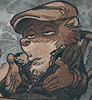
Twice a day, kids.
And apparently enough time had elapsed that I forgot why I don't do linework anymore 9_9 This one took two sittings, haha. At least I feel like I can see where that time went, though, and I like the result pretty well, so it's all good ^_^
Plus, with fabercastel drawing Chester* recently, I was struck with a new wave of dachshund fever <3 I had to draw him again myself. Here he is, rasslin' with bedhead while he gets ready to kick off his day.
*tasteful nude behind the link, so fair warning <3
And apparently enough time had elapsed that I forgot why I don't do linework anymore 9_9 This one took two sittings, haha. At least I feel like I can see where that time went, though, and I like the result pretty well, so it's all good ^_^
Plus, with
fabercastel drawing Chester* recently, I was struck with a new wave of dachshund fever <3 I had to draw him again myself. Here he is, rasslin' with bedhead while he gets ready to kick off his day.*tasteful nude behind the link, so fair warning <3
Category Artwork (Digital) / All
Species Dog (Other)
Gender Male
Size 630 x 835px
File Size 332.8 kB


He's got the  moto googily eye! All... bulged like that... they weird me out, to be honest. XD
moto googily eye! All... bulged like that... they weird me out, to be honest. XD 


Hehee dawgy. His tongue! What's sup with the single color tones? Is that your STTTTYYYLLLE? :33
try SAI out for line art. You can do vector that behaves like normal lines when drawn, then adjust them later. Makes inking almost pleasurable.
it's not quite Photoshop Pentool for precise geometrical shapes and curves though.
try SAI out for line art. You can do vector that behaves like normal lines when drawn, then adjust them later. Makes inking almost pleasurable.
it's not quite Photoshop Pentool for precise geometrical shapes and curves though.


Doing mirror stuff is really hard (for me) it turns out ^_^ Especially considering it means you *have* to be looking at the scene from the side (otherwise you'd have a big fat view of the back of his head...), which means you have to draw the rest of the scene in perspective instead of an easy straight-on grid. That said, I think all the tile and the mirror would get pretty boring if it were all at simple right angles, so I'm glad to have had the motivation to put in the effort to make it a little more interesting.


Hehe, I guess I could have pushed the bed-head further, huh?
And thanks! I was going for an old Japanese/nouveau postcard look with the linework and flat tones. I don't think that was particularly successful, but I like the end result well enough that I'm content to let myself off the hook this time ^_^
And thanks! I was going for an old Japanese/nouveau postcard look with the linework and flat tones. I don't think that was particularly successful, but I like the end result well enough that I'm content to let myself off the hook this time ^_^

Yes! There are two texture layers over this piece, but turned pretty far down, opacity-wise. One is an old paper scan, and one is an oil painting canvas that just has some blobby flat neutral tones on it, but enough variety to make it work nicely as a texture.
And this time around, I started with a very desaturated palette with very little range as far as value goes. Over the course of adding the texture layers and doing a goodly bit of gradient map/color balance/vibrancy and saturation tweaking, it turned into this, which is pretty common for me. I think the reason so much of my stuff winds up in the red range is because there are a lot of nice effects you can get by gradient mapping a piece that take it into the red range.
The one thing I do try to check on a piece is how it looks in monochrome -- if a picture looks terrible desaturated, then it's not going to look particularly good with color on it, either. Considering the fact that I'm eventually going to gradient map it, I could just start out painting in black and white, get a solid monochrome image, and then map that and wind up with something fully decent, but I do like to at least pretend like I'm picking colors that matter in the long run <3

Wow this works amazingly!
I'm obsessed with candid shots of furries. Since they're so fictional, they are most often portrayed in overly glorified ways which, can totally lend to fantasy indulgence, but seeing them doing non-glamorous, everyday chores imbues them with a more tangible sense of realism. You know, making them easier to relate to and feel connected with.
Add to it your fine ability to turn a scene like this beautiful and artistic...man, couldn't ask for anything more :)
Totally. It's the same reason I enjoyed the 3rd Harry Potter flick so much.
Cuaron took all the fantasy elements of the books, but shot it with a much more gritty, hand-held, reality based style. So, it made the fantastical elements pop seeing them juxtaposed against a world that seemed "real" as opposed to "fairy tale"-ish
Cuaron took all the fantasy elements of the books, but shot it with a much more gritty, hand-held, reality based style. So, it made the fantastical elements pop seeing them juxtaposed against a world that seemed "real" as opposed to "fairy tale"-ish


Haha, I honestly think it's because I don't have sensible person filters. Like, I think most people wouldn't think, "I should draw a dog-man brushing his teeth" (because, I mean...WHY?), or, if they did, they would dismiss it before actually spending 10 hours punching out the linework 9_9


Well one thing's for certain; your layers are much more organized than mine :3 I really need to learn to do things in passes rather than on whim, because I end up having like 20 layers of normal and overlay and multiply stacked up on one another like some sort of fucked up sandwich.
And then I try and compress what I can to clean things up, but alas, you cant merge a normal onto an overlay without affecting things etc :3
Not to mention that I end up taking too long if I'm always making little adjustments. Or that I can't erase around it without having to hunt for the exact layer that something's on, etc etc.
Also haven't tried out some of the things like that gradient color adjusting thing :3a Or making lines/designs.
Well, I'm glad there's *something* fresh in there for you <3
Although, to be perfectly honest, some of the layers shown in there are probably fudged <3 Haha, I know some of the sketch/in progress shots were actually reverse-engineered from the final because I'd flattened the picture or painted it all on one layer 9_9. So basically I'm a HUGE LIAR.
Although, to be perfectly honest, some of the layers shown in there are probably fudged <3 Haha, I know some of the sketch/in progress shots were actually reverse-engineered from the final because I'd flattened the picture or painted it all on one layer 9_9. So basically I'm a HUGE LIAR.


It just takes forever ^_^
It'd probably go faster to do the lines in pencil and scan them in (like I did with the flowers in the coffee cats picture), but sometimes I'm just too lazy to bother. Doing linework in Photoshop is slower going, but it's easy enough. Kills my hand, tho @_@
It'd probably go faster to do the lines in pencil and scan them in (like I did with the flowers in the coffee cats picture), but sometimes I'm just too lazy to bother. Doing linework in Photoshop is slower going, but it's easy enough. Kills my hand, tho @_@


Thanks, dude ^_^ And yeah, the linework was all done with a tablet. I find the pen tool is great for doing graphic stuff and making some tricky selections, but I don't tend to use it for my regular linework because the results feel cold and mechanical compared to freehanded stuff. Or sometimes I'll use the pen tool to get the curves and lines how I want them, then trace over that on a new layer freehand and use that.

Ahhh okay. So if I can further ask.... have it set as a tapered brush I'm assuming? But still....how the heck can you ink so steadily with a tablet?? Hehe! I mean in Illustrator and Flash at least they have line smoothing. But I've tried in Photoshop and just jittering all over the place. Crazy. :)
Yeah, you'll usually want a brush with pressure controls set to size and not opacity. In general, it's a matter of making a stroke and either having it be right, or undoing it. Trying to go back and correct it afterwards rarely looks right, and invariably involves more work than just trying repeatedly with your fingers on the CTRL+Z until it's right.
It's basically hell of time-consuming.
It's basically hell of time-consuming.
Haha, well the texture layers are a gimme. You throw on the layer, set it to like Color Burn, scale it down to 15% opacity, and you're done 9_9
But yeah, mark-making is one of the really time-consuming parts of learning to make art. That and observation take years to cultivate, but it's a fun process if you can keep from getting too frustrated along the way ^_^ It's as much muscle memory as anything else, so you just kinda have to draw a bajillion times and watch it all come together <3
And no problem -- I'm all for Q&A.


Comments